An animated commercial introduces an idea with a persuasive purpose; motion graphics gives graphic elements rhythm, structure and movement. They often work together. A campaign might use an illustrated film as its main piece, then adapt the same visual language for shorter edits, social placements or an event screen.
Studio Poink’s services include commercials, promotional corporate videos, informative clips and animated series. Our portfolio shows several ways animation can serve a communication setting. This guide explains how to plan a campaign around that setting, with deliverables that feel intentionally designed wherever they appear.
Start with the communication job
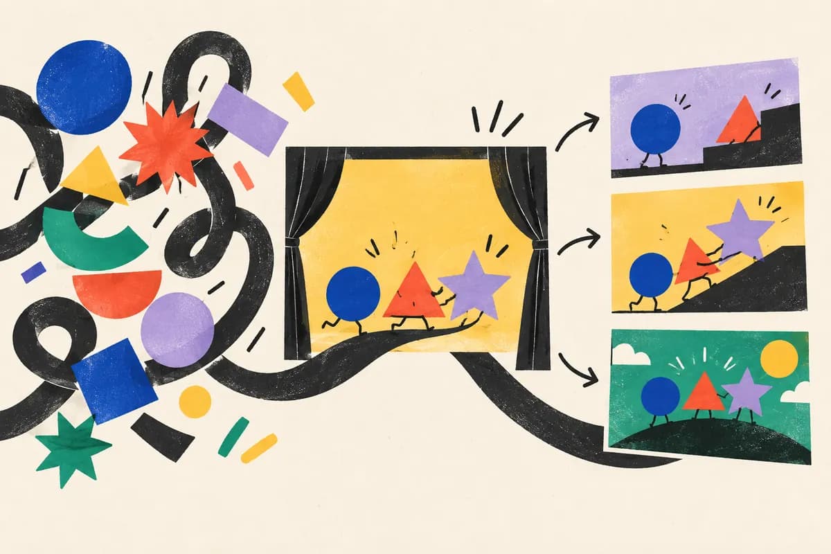
A launch film, a brand commercial and a convention loop have different jobs. A launch may need to introduce a new offer. A brand film may establish a feeling or point of view. A booth screen may need to explain something to people who begin watching halfway through.
Write down the audience, the viewing situation and the next action you want to invite. Then decide what the viewer should remember if they take away only one thing. This gives the creative work a priority when the script, imagery and required information compete for attention.
A shorter edit is not automatically a condensed version of every scene. It may need its own opening and a smaller communication goal. Plan these roles before producing the main film so each version has a clear reason to exist.
Design for the frame, not just the crop
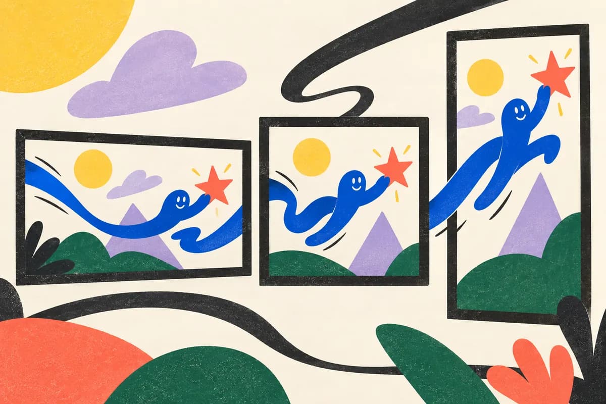
A wide composition can place characters, typography and product imagery side by side. A portrait composition has different spatial relationships. Simply cropping a finished wide film may remove the subject, shorten a movement or leave text too small.
List the required placements at briefing stage and confirm their current delivery specifications with the publishing or media team. Common shape families include landscape, square and portrait, but exact dimensions, duration limits and interface overlays depend on the destination.
- Landscape film: consider presentation screens, website use and the space around the subject.
- Square or portrait edit: recompose important actions and text for the available frame.
- Short cutdown: choose the message and opening that can stand on their own.
- Event loop: consider entry at any point, repetition and viewing distance.
- Language version: allow for translated text, narration and differences in timing.
These are planning prompts, not a fixed deliverables package. Agree on the number of versions and the adaptation work in the production scope.
Make the message work in its viewing environment
Sound design, music and narration can contribute to the experience, but some placements must communicate when sound is unavailable. Decide which information is carried by action, which needs text and which benefits from narration.
For a silent presentation, a clear sequence of visual events may do more than adding longer captions. Show the relationship or transformation, then use short text to identify what the viewer is seeing. Test legibility at the intended viewing size instead of reviewing only on a large design monitor.
When speech is included, plan captions and review them for accuracy and readable timing. Keep essential information available in a text description or transcript where the publishing context supports one. Check that important meaning is not conveyed through color alone.
Keep a recognizable visual language across the campaign
Consistency comes from a small set of deliberate choices: color, typography, illustration, transitions and the way objects move. Repeating those choices can connect a short social edit with a longer film without forcing them to use identical compositions.
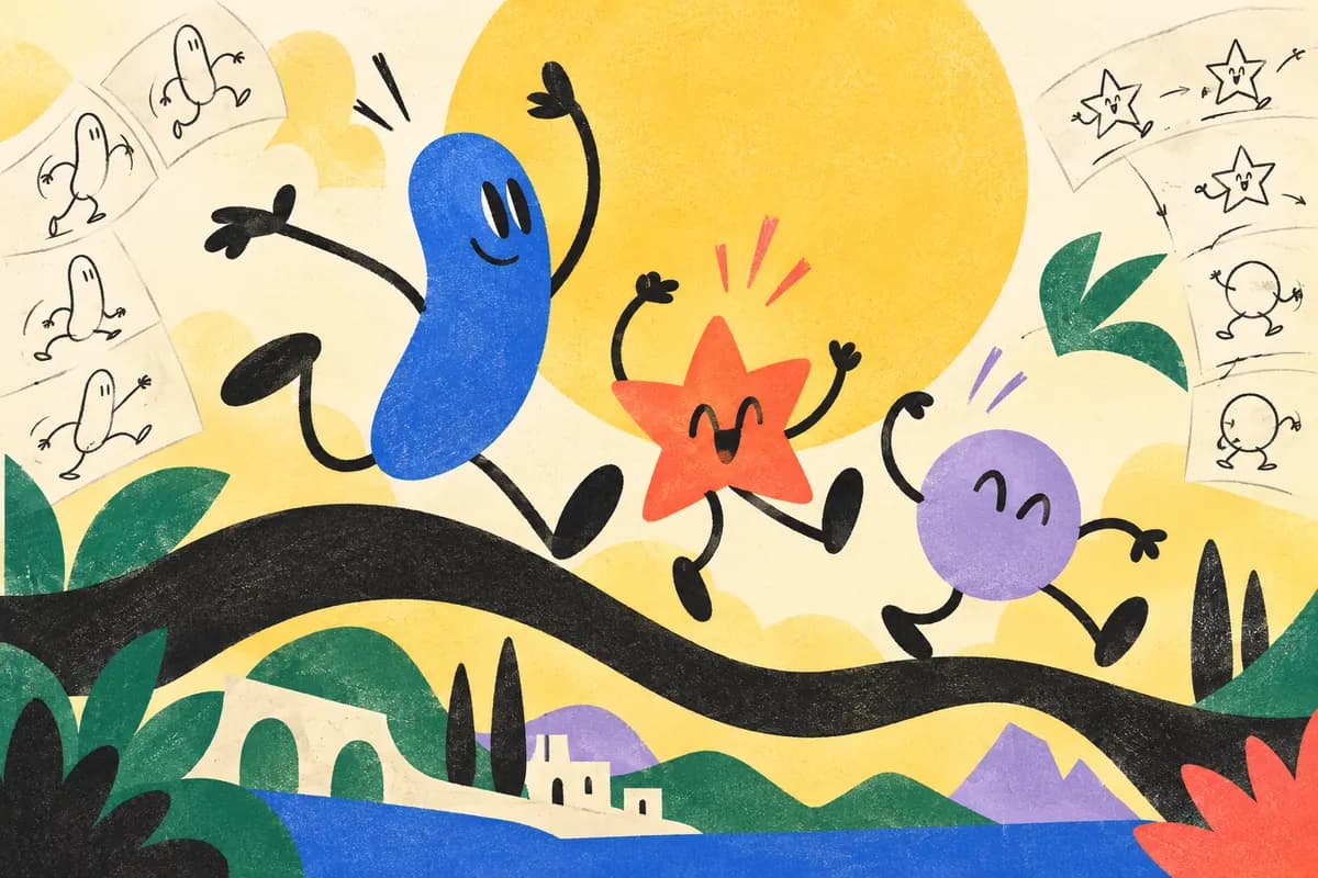
Build the visual language around the idea. A bold graphic concept might use type and simple shapes; a story about people may benefit from character performance. Our character animation guide explains how to choose a character’s role. If the campaign must explain how a product works, see our explainer production guide.
Review representative frames in the intended formats before committing to all the animation. Check the opening, a complex middle scene and the closing invitation. This makes it easier to spot a layout problem before it appears across many versions.
Campaign and screen examples from Studio Poink
Our Kan11 project is a series of animated commercials for radio shows. It is a useful reference for thinking about several pieces of content connected by a creative treatment.
The AU10IX convention booth video was designed to communicate through explanatory visuals without narration. Its context makes the sound decision part of the concept itself, rather than an adjustment after production.
The WIX project presents another collaboration model: the Wix team supplied the original art and script, and Studio Poink created the animation. Your brief should similarly identify which creative materials already exist and which parts of production need to be developed.
What should be agreed before production begins?
Define the main film, additional edits, formats, languages, captions, audio and delivery dates. Identify who approves product claims, brand decisions and final files. Confirm music, voice and artwork usage as part of the agreement, especially if the campaign has multiple channels or territories.
After launch, evaluate each version against its intended job. A website introduction and a convention loop are unlikely to share the same success measure. Use the available viewing and response data alongside feedback from the audience; the animation alone cannot establish what caused a business result.
Discuss your animated campaign with Studio Poink. Bring the message, intended placements, launch timing and existing brand materials so the conversation can connect creative ideas with a practical production scope.